Art plays a crucial role in capturing the attention of audiences, particularly in marketing and the creation of advertising materials. Having strong artistic skills is essential for this purpose. The reason is that people’s brains often associate specific colors with certain emotions, which serves as a key bridge between marketing materials and the target audience. Therefore, having knowledge of color matching is vital for producing impactful advertising visuals.
When you observe advertisements from major brands, you’ll notice the deliberate use of colors. Often, the colors in various images share a consistent palette — this is not by chance but by design. This is known as color matching, a principle rooted in art and supported by research that connects color choices to consumer expectations and industry standards. In this article, we’ll guide you through effective color pairing techniques for creating standout advertising visuals.
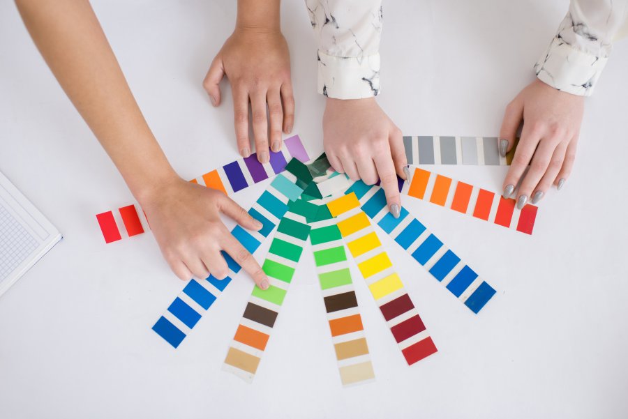
Designing advertising images and banners involves utilizing a variety of colors to make visuals more attractive. However, randomly mixing colors without principles will not help your work stand out. Color matching is the process of selecting and combining colors to achieve harmony and balance. A well-matched color palette enhances the visual appeal of an advertisement while aligning with its context. Effective color combinations also enhance viewer engagement and help convey the intended emotions or messages within an advertisement.
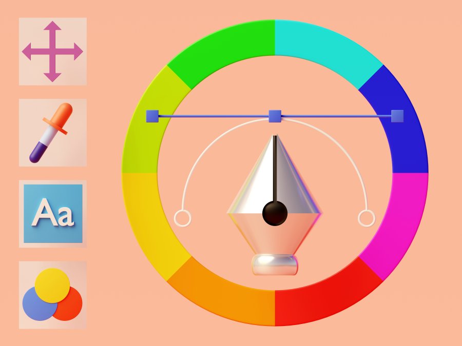
Common Color Matching Techniques in Advertising
**Monochromatic** – Using variations of a single color by adjusting brightness and saturation, such as dark blue and light blue. This creates a calm and cohesive visual effect.
**Analogous** – Utilizing colors that are next to each other on the color wheel, such as green, yellow-green, and yellow. This technique offers a balanced and harmonious appearance.
**Complementary** – Combining colors that sit opposite each other on the color wheel, such as red and green. This method creates striking and dynamic visuals.
**Split Complementary** – Choosing one color and pairing it with two adjacent colors to its opposite on the color wheel, such as yellow with light and dark purples. This maintains vibrancy while softening contrast.
**Triadic** – Employing three evenly spaced colors on the color wheel, such as blue, red, and yellow, to achieve balanced but distinct color variation.
Effective color matching requires considering how colors complement each other and the emotional impact they may evoke. Testing and adjusting according to specific objectives and contexts is essential.
The Importance of Color in Marketing and Advertising
Before learning how to effectively combine colors in advertising, it’s essential to understand color theory and the ideal palettes for marketing. Color plays a pivotal role in aesthetics, reflecting beauty and conveying messages that people naturally perceive through sight. In marketing, visual content enables brands to communicate more effectively and capture broader attention.
Consider red and white sheets of paper with identical messages — people are more likely to notice and pick up the red one. This highlights the importance of careful color selection in advertising. Incorporating a variety of colors can certainly enhance visual interest, but skilled graphic designers understand that color combinations must be intentional and balanced to produce aesthetically pleasing results that align with design principles.
The Influence of Color in Banner and Advertisement Design
When designing advertisements or eye-catching banners, never overlook the power of color as the ultimate visual attractor. Colors can stimulate emotions, brain connections, and audience reactions. Designers should select tones that align with brand messaging and encourage interaction through well-applied color psychology to achieve diverse marketing objectives.
The Psychology of Color in Advertising Banners
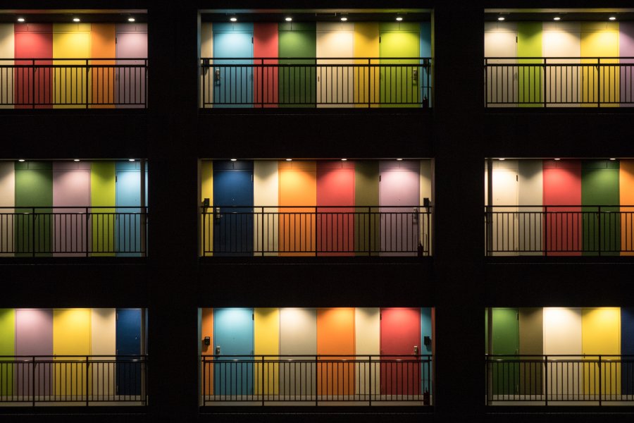
Each color evokes distinct emotional responses, prompting many psychologists to study how colors influence human feelings. Here’s a breakdown of common color associations in advertising:
**Red:** Associated with urgency, excitement, and decisiveness. Ideal for time-sensitive promotions encouraging immediate action.
**Blue:** Represents trustworthiness, calmness, and professionalism. Commonly used in banking, insurance, and tech industries to convey security and reliability.
**Yellow:** Evokes fun, energy, and warmth. Captures attention quickly and suits campaigns aiming to foster friendliness and positivity.
**Green:** Symbolizes balance, growth, and nature. Widely used in health, sustainability, and eco-friendly products to promote safety and environmental consciousness.
**Orange:** Vibrant and confidence-boosting, orange draws attention and reflects friendliness. Suitable for approachable, engaging campaigns.
**Purple:** Conveys luxury, imagination, and creativity. Best for brands or products aiming to showcase uniqueness and sophistication.
Techniques for Using and Matching Colors in Banner Design
Creating effective banners requires a strategic approach to color. Colors not only attract attention but also enhance message recognition and emotional engagement. At Asia Search Solution, we recommend these techniques:
**Analyze your brand identity.** Understand your brand’s goals, desired image, target audience, and messaging to choose colors that best reflect your identity.
**Select primary and secondary colors.** Primary colors dominate the design, while secondary colors support balance and enhance the overall visual without clashing.
**Use color to emphasize key messages.** Contrasting colors can highlight crucial content such as promotions, discounts, or new product launches. Bright shades like red or orange often work well here.
**Align colors with desired emotions.** Choose colors that evoke feelings matching your audience’s expectations and preferences, using psychology to strengthen engagement.
Conclusion
Color matching for advertising visuals is straightforward once you understand its principles and how colors evoke different emotions. Properly combining colors enhances both aesthetics and effectiveness. Additionally, overall composition matters. For businesses seeking standout advertising visuals, consider our comprehensive Facebook Marketing services and graphic design and video production services.